

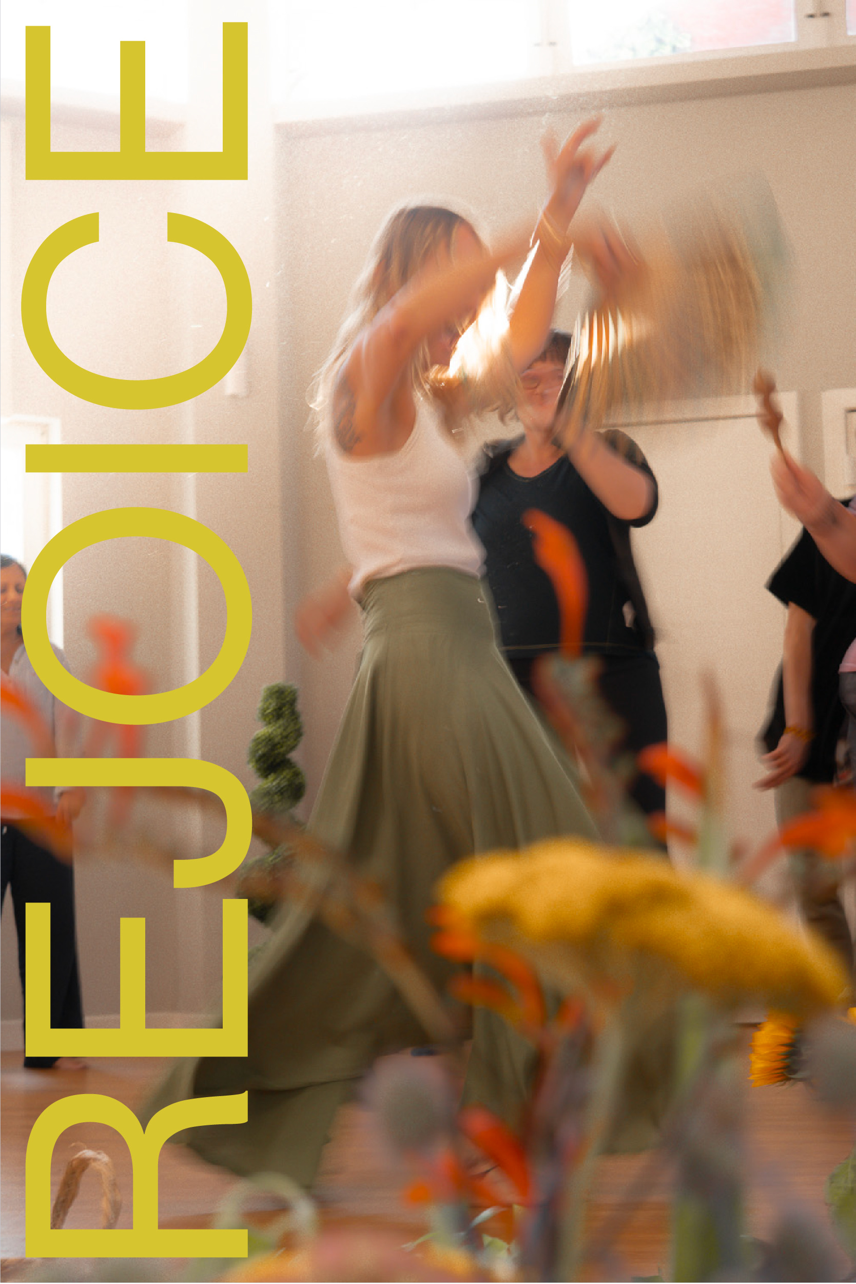
REMEMBER is a wellness company based in Scotland and led by Gemma Nealon and Stephen Clarke. They offer retreats, workshops and other community gatherings that help people reconnect with themselves. Stephen and Gemma came to Studio Zo with a clear challenge. Their message was powerful, yet their existing brand identity was sparse, not professionally designed and leaned too soft. It wasn’t reaching the men they wanted to welcome in, nor was it strong enough to stand out in a saturated wellness landscape.
They needed a visual identity that had more impact. Something grounded, modern, and assured. A brand that could balance warmth with their no-nonsense approach, and emotion with clarity, without losing the soul at the heart of their work.
We shaped an identity built around that balance. The result is a brand that is primarily masculine leaning, with subtle softer touches, added as if seasoning to food. The new brand identity is distinctive, aligned with their brand and business strategy, and better equipped to support REMEMBER’s mission as they grow their community.
Brand Identity Design
Logo Design
Illustration
Location:
Edinburgh, UK
Year:
2025


How did we bring this new identity to life for REMEMBER? We began by understanding how their existing brand was landing with people. Their events were popular, but more so with women than men. They want an equal mix of men and women, but they were struggling to attract enough men. The visual identity was part of the problem. It felt too soft and didn’t represent the fuller, more balanced energy of their work.
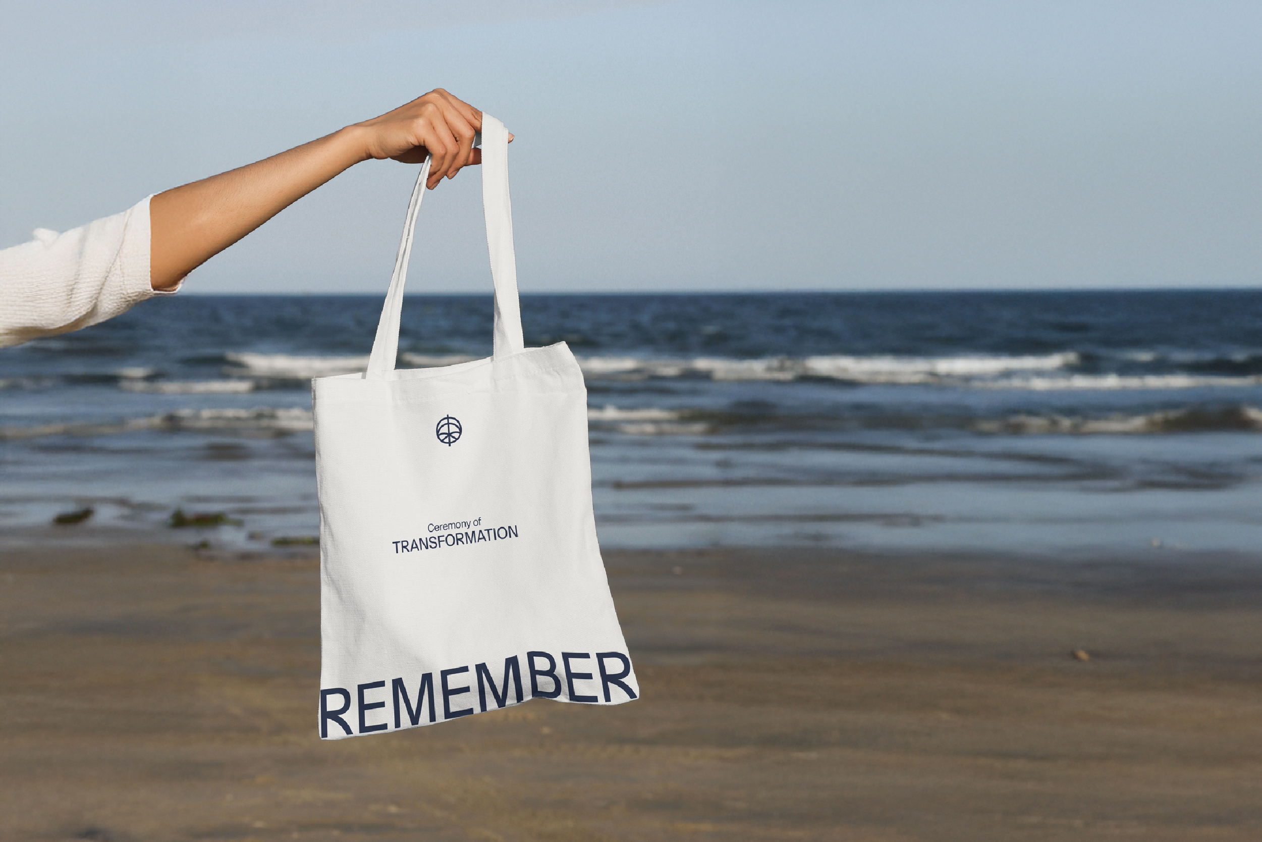
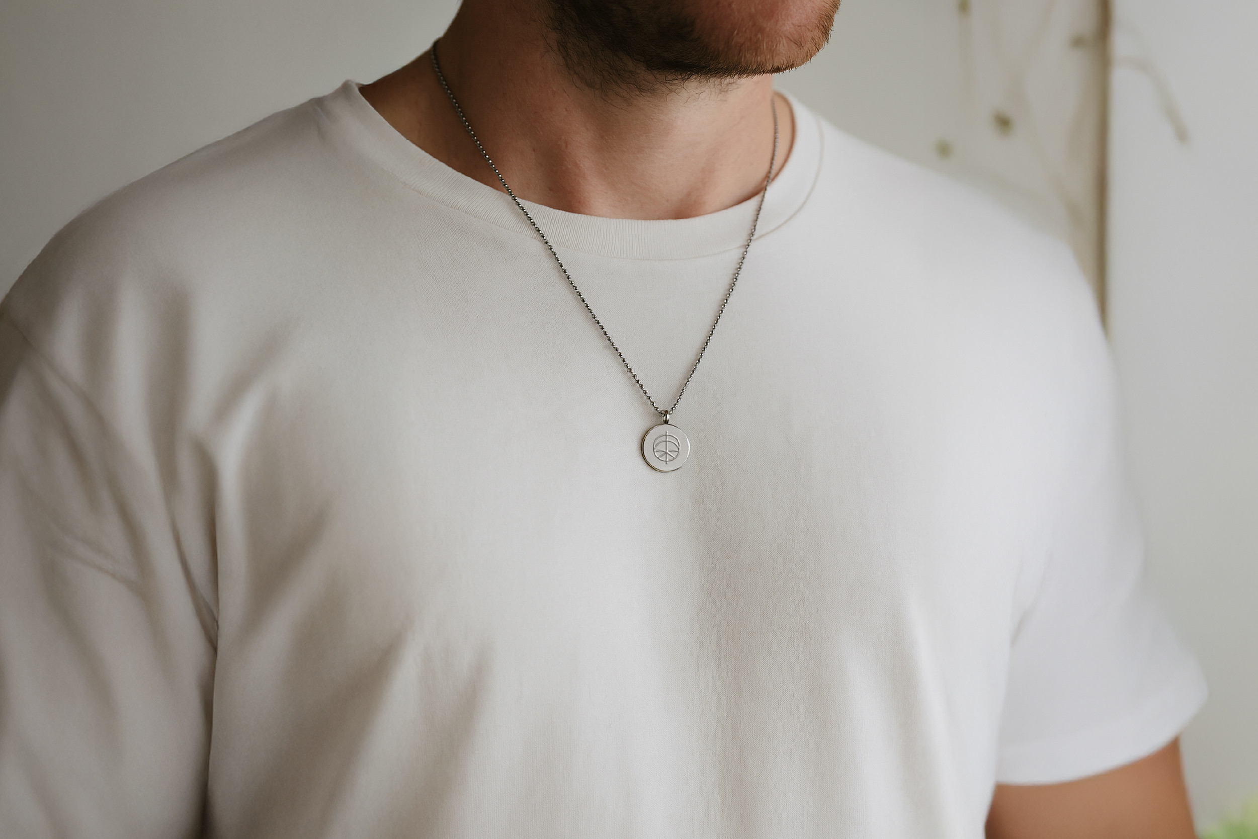
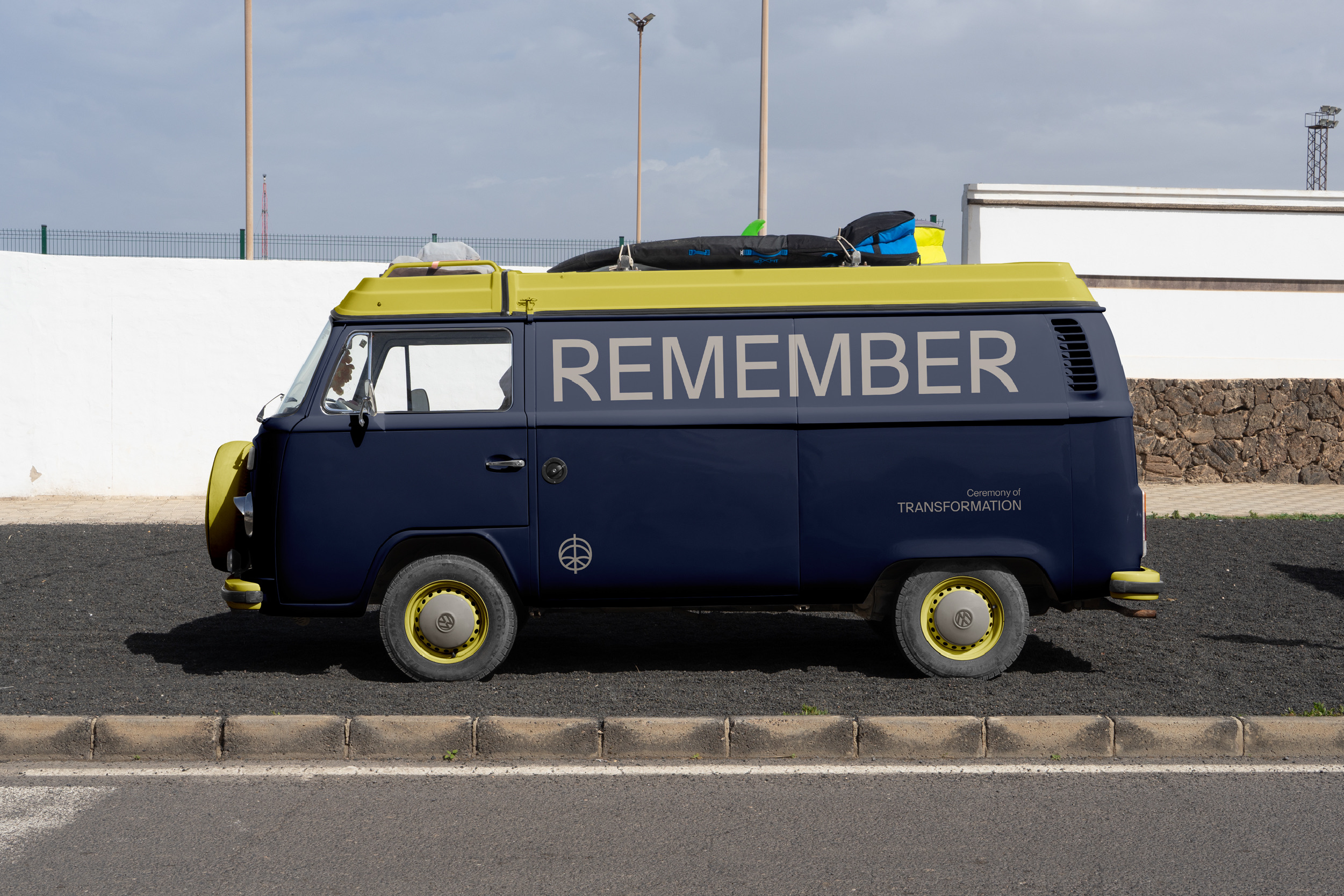
Our aim became creating a visual identity with more structure, clarity and presence, while still keeping the warmth and openness that are important to REMEMBER. This shaped the development of the new logo mark. Its meaning comes from several symbols layered together. The circle speaks of wholeness. The moon and crescent bring in rhythm, intuition and ancestral wisdom. The mirroring expresses reflection. The saltire roots the brand in Scotland. The root form represents grounding and memory. And the final shape hints at the letter R, holding the brand’s name at its core.
We carried this thinking into the wider identity. Typography is set in Pangram Pangram’s Neue Montreal, a clear and minimal sans serif with strong, confident structures. The colour palette brings together deep blue, soft off-whites, earthy neutrals and a vibrant highlight shade. Shadow Work (deep blue) anchors the brand with depth and is a nod to inner work. Cloud Nine (off-white) and Mushroom (taupe) add earthiness and a sense of calm, while Afterglow (chartreuse) introduces a fresher energy that reflects the uplift people often feel after REMEMBER's events. To ensure seamless application with every user touchpoint, including print, we sourced the exact paper stock match for each brand colour form GF Smith papers.
Graphic elements stay minimal but meaningful, using symbolic shapes and subtle illustrations inspired by Scottish heritage and natural textures. Altogether, these choices help the brand feel modern, alive and distinctive, while staying true to the emotional quality of their work.
We also created hand-drawn illustrations of plants such as mugwort and nettle, using soft, textured strokes that feel natural and add a human touch. These illustrations offer a gentle contrast to the cleaner graphic elements, helping the brand feel more personal, soulful and connected to the land that is their home.
The outcome is a visual identity that feels clearer and stronger. It gives REMEMBER the presence they need to stand out in a crowded wellness space while still feeling warm and human. Every element, from the logo to the colour palette and illustrations, works together to reflect the balance at the heart of their work. Every element is intentionally set out to attract their target audience and achieve a 50/50 audience mix.
REMEMBER now has a cohesive brand identity that helps them present themselves with confidence as they grow.
We love what you did. The colours are perfect and the logo is fire! Thank you so much for creating such a wonderful brand for us.

